Similar product descriptions across models
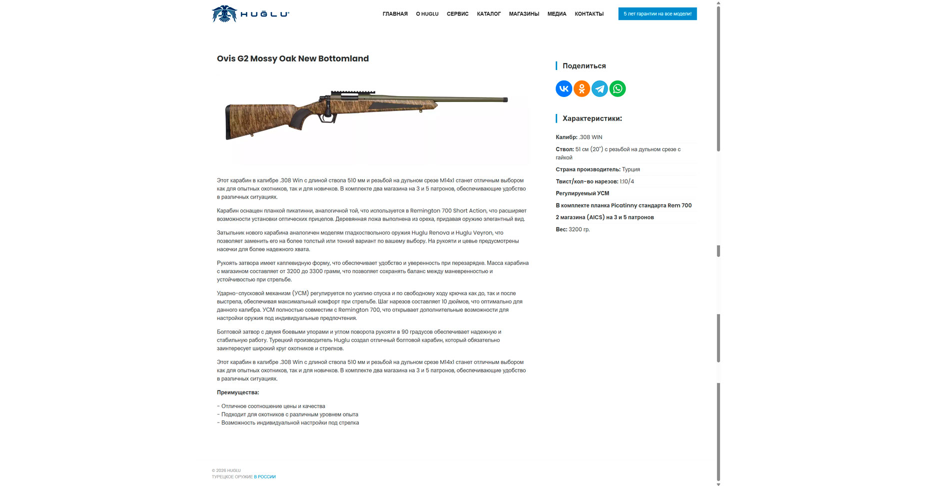
It is difficult for the customer to understand how one model differs from another. The website does not communicate product character and does not strengthen the choice in favor of a specific item.
This page is designed as a web presentation: with a clear narrative, visual comparisons, explanation of the selected concept, and direct links to live demo screens.
The problem is not simply that the website is “old”. The problem is that it does not create a sense of premium quality, does not properly reveal the models, and does not help the brand look stronger at the moment of first contact.
It is difficult for the customer to understand how one model differs from another. The website does not communicate product character and does not strengthen the choice in favor of a specific item.
Visually, the website feels like a standard technical product list rather than a digital showcase for a premium manufacturer.
The technical specifications are there, but there is no sense of status, quality, confidence or value of ownership – and in the segment of informed choice, this is very important.
The user does not get a clear route: what matters, where to look, what makes the model strong, and what the next step should be.
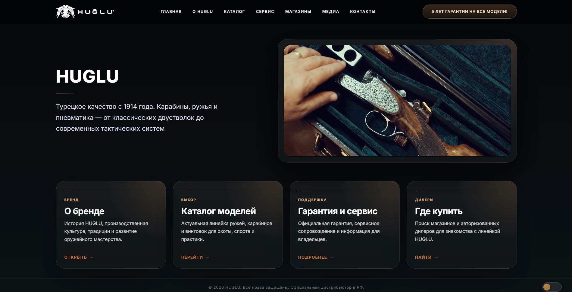
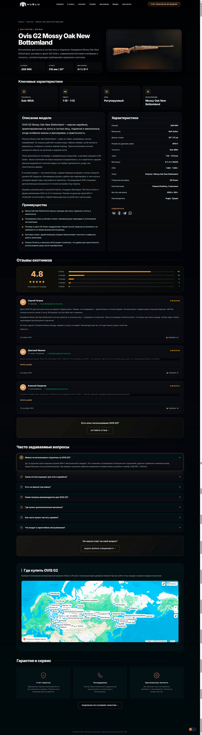
The difference comes not from the product itself, but from the way it is presented. Below is a visual comparison between the current approach and the new direction.
Open full size
Open full size
Open full size
This is not design for “effect”. It is a visual language in which status is communicated through control, proportion, rhythm, space, interface materials, and quality of detail.
Minimum unnecessary elements, maximum control. Calm confidence works stronger than aggressive “marketing” design.
Focus on the product, contrast, readability, and a sense of quality.
Clear structure, strong headlines, comfortable reading.
The website does not overload the user and helps them understand the main point faster.
Delicate movement, soft hover, and refined motion make the interface feel modern without turning it into a show effect.
Product cards, specifications, reviews, clear model differences, and a quick path to decision-making.
It is important to present this honestly: a new website does not “magically create sales”. But it does influence how strong the brand looks in the digital environment and how prepared the customer is when approaching a purchase.
Before speaking to a dealer, the customer almost always sees the website first. That is where the first impression is formed: whether they are dealing with a serious brand or just a standard catalog.
When the website looks cohesive, premium, and confident, the brand is remembered better and trust begins to form before any live interaction.
A strong homepage and product page shorten the path to a decision: the customer arrives better informed, asks more precise questions, and makes a decision faster.
Strong digital presentation creates a positive attitude toward the brand.
The brand is remembered better and stands out more strongly against competitors.
A premium interface enhances the perception of reliability and status.
The customer reaches inquiry, comparison, and decision faster.
Even a small increase in interest and conversion can create a noticeable financial effect.
The homepage is responsible for the first impression of the brand. The product page is responsible for the moment of choosing a specific model. Together, they show the full journey of perception: from entry point to target page.
The first point of contact, where the website must instantly establish the brand level, rhythm, visual status, and the overall feeling of quality.
The final point of persuasion, where the user compares, evaluates, and makes a decision.